Work style
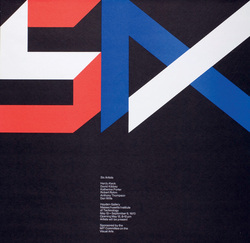
A lot of the graphics work that Jacqueline does consists of posters, a reason why this is may be because as she was the director of design services they could have been to advertise/publicize any exhibitions that MIT had set up. regardless of the origin for her designing posters she has been internationally recognized for her 'elegant posters', some would say that her sense of humor and playfulness made the distinction for her work from being good, to great. When designing these posters she will often use strong elemental imagery manipulated by letterform and will also acknowledge the grid method in her work, i can tell this because the proportion of how the work is laid out is very well done. This example to the left proves these points made.
Further examples
Below are further examples of Jacquelines work showing what they are called, what their original sizes are, what format they are and where they are currently.
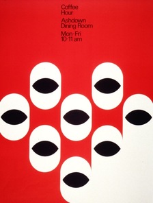
Title: Coffee hour.
Year: 1979.
Size: 55 cm x 42 cm.
Format: Poster Design.
Location: RIT Library.
Year: 1979.
Size: 55 cm x 42 cm.
Format: Poster Design.
Location: RIT Library.
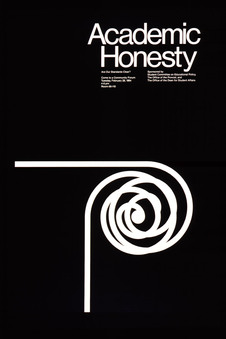
Title: Academic honesty : are our standards clear?
Year: 1984
Size: 58 cm x 39 cm
Format: Poster Design
Location: RIT Library
Year: 1984
Size: 58 cm x 39 cm
Format: Poster Design
Location: RIT Library
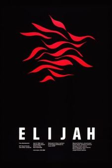
Title: Elijah : Felix Mendelssohn
Year: 1984
Size: 62 cm x 40 cm
Format: Poster Design
Location: RIT Library
Year: 1984
Size: 62 cm x 40 cm
Format: Poster Design
Location: RIT Library
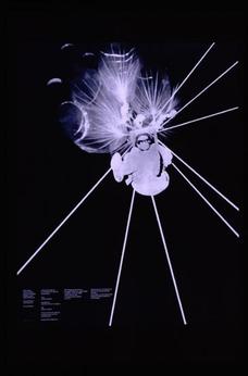
Title: Lift equilibrium : an outdoor experiment
Year: 1969
Size: 68 cm x 53 cm
Format: Poster Design
Location: RIT Library
Year: 1969
Size: 68 cm x 53 cm
Format: Poster Design
Location: RIT Library
my personal VIEWS on Jacqueline's work
Personally i really like the posters that Jacqueline has designed mainly for their neat organisation and layout which proves her use of grid method. I like the kinds of colours used even though a lot of the time they are just black and white it still gives of a strong look, the backgrounds of some of her work is also interesting and are not always plain coloured backgrounds but also show some interesting texture's. Also in some of her work, like the coffee cup poster which is one of my favourites she uses a pattern or repetitive style to communicate through her work, in this case advertising a coffee hour at MIT. A reason why this is one of my favourite pieces is because its is such a simple, yet effective one, especially the coffee cups themselves and how going from left to right they just elegantly fade into one solid colour. Overall i think her posters are brilliantly designed and always follow a set of rules to make sure they work well, but also her good will and sense of humor makes the difference too.
